No public preview image is available.
Unit Pro font family (14 fonts)
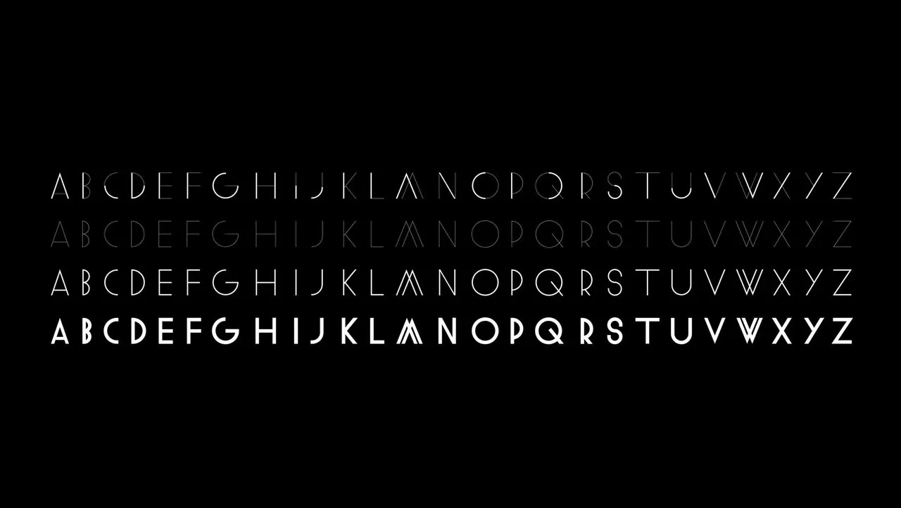
FF Unit was designed by Erik Spiekermann and produced by Christian Schwartz. FF Unit is the grown-up, no-nonsense sister of Spiekermann?s famous FF Meta?in FF Unit, all of the puppy fat is off; some curves have been flattened out, and the letters? shapes are tighter.
Since FF Meta has always been a little out-of-line, and isn?t exactly an over-engineered typeface, FF Unit is less outspoken and more disciplined. Like FF Meta, it is very suitable for use in both large and small sizes. FF Unit lacks some of the diagonal strokes and curves that give FF Meta its touch of informality. However, this difference does not make FF Unit cold or uptight, just cool. FF Unit has no redundant ornamentation, just a lot of character. The tighter shapes make it suitable for big headlines that are set closely. Smaller sizes benefit from the increased contrast between vertical and horizontal strokes and open spacing. Thin and light perform well set large, displaying the characters to their advantage. There is a great difference in weight between the thin and ultra, providing a good range of weights for contrasting combinations. Alternative characters (a, g, I, j, l, U, M) make for interesting headlines. The small caps are a bit larger than normal, making them suitable for abbreviations and acronyms. All fonts include old style figures, and tabular figures, too.
FF Unit was honored with a Certificate of Excellence in Type Design by the Type Directors Club in 2003.